


One of the most common model used in Machine Learning is Linear Regression.
The linear regression determines the line that best represents the trend and relationship between two variables. Once the relationship (correlation) is defined a linear regression model can be trained to make predictions for future events.
The linear regression is just one technique of the Regression Analysis. And depending on the data being analyzed you may take other statistic model:
Nonlinear Regression
Polynomial Regression
Logistic Regression
Bayesian Linear Regression
On this article we will make predictions on outputs that has linear correlation with multiple input variables. Here are the steps we will follow:
Data Preparation
Data Exploration
Train the Regression Model
Evaluate the Model
Next Steps
But first lets review the dataset for the project.
The Dataset
We will create a simple regression model to predict the number of flights that will be delayed at the arrival to its destination.
The data set used can be found in Kaggle.
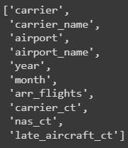
This data is structured by carrier, airport and contains the different reason of delays. You can review in more details at the Kaggle dataset page.
The target feature is 'arr_delay' which represent the total arrivals delayed.
Lets clean this data.
Data Preparation
In order to train any Machine Learning model in python it is necessary to have clean data and in the right format. Therefore, we will first:
Handle null values
Convert text column into category codes
Handle Null Values
Lets import all libraries we will need throughout the project:
import pandas as pd
import numpy as np
import matplotlib.pyplot as plt
import seaborn as sns
from scipy.stats import f_oneway
from sklearn.linear_model import LinearRegression
from sklearn.model_selection import train_test_split
from sklearn.compose import ColumnTransformer
from sklearn.pipeline import Pipeline
from sklearn.impute import SimpleImputer
from sklearn.preprocessing import OneHotEncoder
from sklearn.metrics import mean_squared_error, r2_score
We will specify the usage of each library and methods as we use them.
Import the data and visualize top five rows to observe data samples.
# Import the data
df = pd.read_csv('Airline_Delay_Cause.csv', low_memory=True)

df.head()

To have an idea of how many null values and the data types in our data set we run the .info() pandas method
df.info()

For a better way to represent the null values we can plot the count of those null records in a horizontal bar plot
# Count of null values
null_counts = df.isna().sum()

# Visualize the nulls
null_counts.plot(kind='barh')
plt.show()

As all of the columns that contains null values should be numeric we can simply replace with 0 to all of those
# Since all features above are numerical, we can replace with 0
df = df.fillna(0)
Text Columns to Category Codes
Most of the Scikit-Learn models can only process numerical values and we have some text values that represent a category. We can identify them and replace their values with category codes in numerical format.
# Identify categorical columns
c = (df.dtypes == 'object')
categorical_cols = list(c[c].index)
categorical_codes = []

# Keep original columns to use in the exploration
for col in df[categorical_cols]:
  col_name = col + '_cat'
  categorical_codes.append(col_name)
  df[col + '_cat'] = df[col].astype('category').cat.codes

categorical_codes

Later on the code we will need to differentiate from categorical and numerical a values, so lets identify the numerical variables as well
# Save original numerical columns
numerical_cols = df.select_dtypes(include=['int', 'float']).columns
numerical_cols

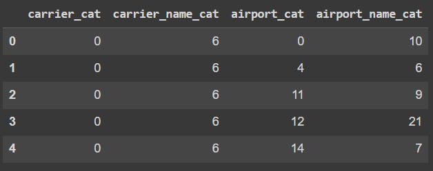
By running the following code we can review the category codes assigned to the new columns
df[categorical_codes].head()
Now that our data is clean and data types corrected we can explore the data.
Data Exploration
On this section, we will capture the correlation between the input data and the target variable arr_delay. For that we complete these points:
Basic stats
Data distribution
Relationships: numerical & arr_delay
Relationships: categorical & arr_delay
Select strong relationships columns only
Basic stats
We can get basic statistics with the describe() pandas method
df[numerical_cols].describe()

From this we can reveal the basic statistic measures that tell us how data is distribute by each numerical column. This are all descriptive analytics since give us the big picture or the data. Lets get more details on distribution of each numerical column.
Data distribution
By reviewing the distribution we can have an idea of the trend by individual columns and also understand how, if exist, outliers skews the data.
To visualize the distribution we will use the matplotlib library. Also a good practice is to plot some descriptive statistic measures such as mean and median to visually analyze the data skewness
# Plot a histogram for each numerical column
# Remove date columns for now
numerical_feature = list(numerical_cols)
numerical_feature.remove('year')
numerical_feature.remove('month')

for col in numerical_feature:
    fig = plt.figure(figsize=(9, 6))
    ax = fig.gca()
    feature = df[col]
    feature.hist(bins=100, ax = ax)
    # plot the mean and median for each column
    ax.axvline(feature.mean(), color='magenta', linestyle='dashed', linewidth=2)
    ax.axvline(feature.median(), color='cyan', linestyle='dashed', linewidth=2)
    ax.set_title(col)
plt.show()
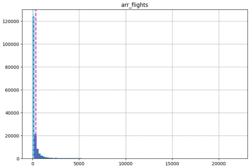
Definitely, there are outliers in the data that makes the plot difficult to review. I will be creating a separate article explain at least five methods to detect outliers. Lets continue as is for now.
The categorical columns can also be review using matplotlib
# plot a bar for each categorical feature count
for col in categorical_cols:
    counts = df[col].value_counts().sort_index()
    fig = plt.figure(figsize=(9, 6))
    ax = fig.gca()
    counts.plot.bar(ax = ax, color='steelblue')
    ax.set_title(col + ' counts')
    ax.set_xlabel(col)
    ax.set_ylabel("Frequency")
plt.show()
This code will create a bar plot for each categorical column. This is the simplest way to review the data distribution by categorical columns. I encourage you to find better ways to do this that includes descriptive statistics. Hint: boxplot in seaborn.

Relationships: numerical & arr_delay
By revealing the correlation of each variable against the target column will help us define what variables are good to be use in a Machine Learning model and make predictions using unseen data.
To find the correlation between all numerical columns and the target column we can use the corr() method in pandas.
On the following code we will iterate through the numerical variables to find its correlation score. Then save that score in a pandas data frame to later access easily just the variables with strong correlation. To visualize each relationship we proceed with plt.scatter() plot.
# Include the correlation coefficient
# Save the coef in a dataframe 'resultCorr'
resultCorr = []

# Plot scatter plots for each numerical column
# remove target columns
numerical_feature.remove('arr_delay')
for col in numerical_feature:
    fig = plt.figure(figsize=(9, 6))
    ax = fig.gca()
    feature = df[col]
    label = df['arr_delay']
    correlation = feature.corr(label)

    # Our trasehold for a strong corr is 0.8
    if abs(correlation) >= 0.85:
      resultCorr.append([col, 'Correlated', correlation,'num'])
    else:
      resultCorr.append([col, 'No Correlated', correlation,'num'])

    plt.scatter(x=feature, y=label)
    plt.xlabel(col)
    plt.ylabel('arr_delay')
    ax.set_title('arr_delay vs ' + col + '- correlation: ' + str(correlation))
plt.show()

resultCorr = pd.DataFrame(resultCorr, columns=['Feature', 'Dependency', 'Correlation', 'Dtype'])
In the above image, if we draw a line that crosses all data population through the middle, we can see a line that represents the the trend of the data.
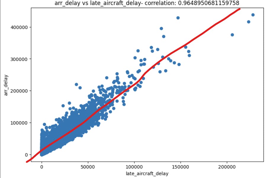
But we can relate this imaginary line with the correlation score. On this example we notice a score of 0.96. Which we can describe as positive strong correlation. When I say positive I mean that if the late_aircraft_delay increases the target column arr_delay also increases. The oposite of this plot would have a score of -0.96, meaning negative strong correlation which tell us that if late_aircraft_delay decreases the target column arr_delay also decreases. And when I say strong I mean that the correlation score, that can range between -1 to 1, tends to -1 or 1.
For instance, if we want to see a weak correlation the arr_cancelled column shows a score of 0.41

As you can tell, there is not clear relationship between these two columns, therefore it is hard to predict arr_delay using arr_cancelled.
Included in the last code we save the correlation of each variable and also specified a threshold of 0.85 or -0.85. The threshold will depend on the specifics of each project.
# Our trasehold for a strong corr is 0.8
    if abs(correlation) >= 0.85:
      resultCorr.append([col, 'Correlated', correlation,'num'])
    else:
      resultCorr.append([col, 'No Correlated', correlation,'num'])
Then we just filter this pandas data frame with the correlated columns only
# review the strongest correlations
# Other columns will be ignored for training
resultCorr = resultCorr[resultCorr['Dependency'] == 'Correlated']
resultCorr

Relationships: categorical & arr_delay
Even though we will be using a linear regression model we can fit categorical data to it as long as we have a well formatted data (numbers) and we make sure these columns are also correlated.
Depending on the output data type you may use different methods to decide either the input data is correlated to the target variable or not. Let me know in the comments if you want an article for that singular topic!
For this project we will use the f_oneway method from Scipy. And to keep it consistent we will store the scores in a data frame for a later use. The difference between the correlation score when we explored numerical values is that now we have categories, therefore we will obtain the p-value from the one way ANOVA test. To validate what columns we keep the p-value will be comparer to an alpha value.
The alpha value is the threshold. It is most common to use an alpha of 0.05, which means that there is a less than 5% chance that the data being tested is not correlated to the target variable arr_delay. We can also discuss deeper on testing hypothesis using ANOVA.
# Set error alpha 0.05
alpha = 0.05
resultAnova = []

# Iterate categorical features
# Add year and month to the category cols list
categorical_cols.append('year')
categorical_cols.append('month')

for cat in categorical_cols:

    CategoryGroupList = df.groupby(cat)['arr_delay'].apply(list)

    F, pv = f_oneway(*CategoryGroupList)

#     check hypotesis using p value
    if pv < alpha:
        resultAnova.append([cat, 'Correlated', pv, 'cat'])
    else:
        resultAnova.append([cat, 'No Correlated', pv, 'cat'])

resultAnova = pd.DataFrame(resultAnova, columns=['Feature', 'Dependency', 'P-value', 'Dtype'])

# review the strongest correlations
# Other columns will be ignored for training
resultAnova = resultAnova[resultAnova['Dependency'] == 'Correlated']
resultAnova

Train the Regression Model
Scikit-Learn provides a large number of Machine Leanirng models and for this article we will use the LinearRegression from sklearn.linear_model.
Steps on this section:
Split training and validation data
Create data preprocess pipeline
Train the model
Split training and validation data
Firsts, select the final columns, based on the correlation analysis
final_cols = list(resultAnova['Feature']) + list(resultCorr['Feature'])

# Remove bias columns (arr_del15, carrier_delay, nas_delay, late_aircraft_delay, )
final_cols.remove('arr_del15')
final_cols.remove('carrier_delay')
final_cols.remove('nas_delay')
final_cols.remove('late_aircraft_delay')
final_cols
Then, using training_test_split() we obtain the training and validation data. The training data will be passed to the model. Once trained we validate the model using the validation data. The training_test_split() method splits the data into these two datasets and the model will never see the X_valid_full and we will ask it to make predictions out f it.
# Split training and validation data
# Separate target from predictions
X = df[final_cols]
y = df['arr_delay']

X_train_full, X_valid_full, y_train, y_valid = train_test_split(X, y, train_size=0.8, test_size=0.2, random_state=0)

X_train_full.info()# Get numerical data and categorical columms from splitted data

numerical_cols = [cname for cname in X_train_full.columns if X_train_full[cname].dtype in ['int64', 'float64']]
categorical_cols = [cname for cname in X_train_full.columns if X_train_full[cname].dtype in ['object']]

# Keep selected columns only
my_cols = categorical_cols + numerical_cols
X_train = X_train_full[my_cols].copy()
X_valid = X_valid_full[my_cols].copy()
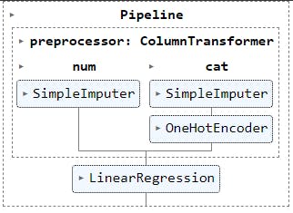
Create data preprocess pipeline
One of the common best practices while building any Machine Learning model is to create a data preprocessor and encapsulate it on a pipeline.
A preprocessor is a set of steps or transformations made to the dataset before being passed to the model. It is intent to handle errors in the data with predefined correction methods. Lets create one.
# Define preprocessing

# Preprocessing for numerical data
numerical_transformer = SimpleImputer(strategy='constant')

# Preprocessing for categorical data
categorical_transformer = Pipeline(steps=[
    ('imputer', SimpleImputer(strategy='most_frequent')),
    ('onehot', OneHotEncoder(handle_unknown='ignore'))
])

# Bundle preprocessing for numerical and categorical data
preprocessor = ColumnTransformer(
    transformers=[
        ('num', numerical_transformer, numerical_cols),
        ('cat', categorical_transformer, categorical_cols)
    ]
)

preprocessor

We first define how to handle numerical columns in numerical_transformer. For the categorical columns we specify the transformers on categorical_transformer.
And finally we bundle these transformers into one preprocessor .
Train the model
We simply create a model object by calling the LinearRegression() class from sklearn. We can pass different
# define the model

model = LinearRegression()
model

Now that we have our data preprocessor defined and the linear regression model created, we can bundle both objects in a pipeline. With this we are telling the pipeline to first validate and transform the data as needed to pass it to the model.
# Bundle preprocessor and model
my_pipeline = Pipeline(steps=[
    ('preprocessor', preprocessor),
    ('model', model)
])

# Preprocessing the training data, fit model
my_pipeline.fit(X_train, y_train)
On the last line of code we pass the training data, divided by input data X_train and output data (target column) y_train.
# Preprocessing the training data, fit model
my_pipeline.fit(X_train, y_train)
Evaluate the Model
To evaluate the model, we need some predictions from the model with data it has not reviewed yet.
# Make predictions using X_valid dataset

preds = my_pipeline.predict(X_valid)
preds

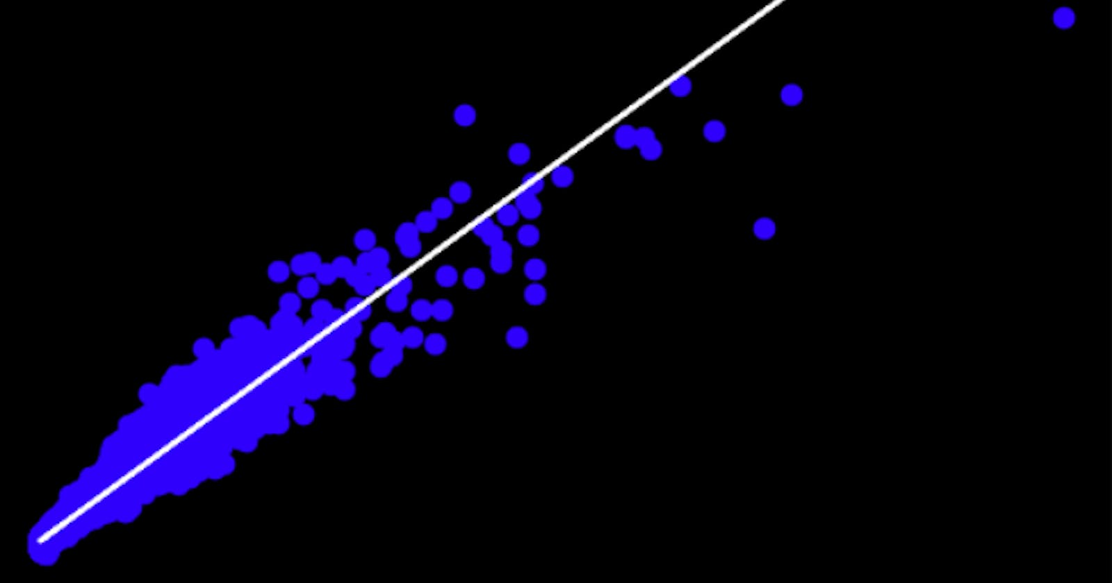
The preds array stores the predicted arr_delay values. Now we can use a scatter plot to compare the the predicted values against the actual values that resides on y_valid.
# Plot prediction vs target valid data
plt.scatter(y_valid, preds)
plt.xlabel('Actual Values')
plt.ylabel('Predicted Values')
plt.title('arr_delay Predictions')
# overlay the regression line
z = np.polyfit(y_valid, preds, 1)
p = np.poly1d(z)
plt.plot(y_valid,p(y_valid), color='magenta')
plt.show()
Above code will plot the predicted and actual values including the regression line.

But we can use some actual metrics to determine how good the model is predicting.
Lets get these three measurements
# Calculate: Mean Square Error (MSE), Root Mean Square Error (RMSE) & R-squared

# Mean Square Error (MSE)
mse = mean_squared_error(y_valid, preds)
print("MSE:", mse)

# Root Mean Square Error (RMSE)
rmse = np.sqrt(mse)
print("RMSE:", rmse)

# R-squared
r2 = r2_score(y_valid, preds)
print("R2:", r2)

Next Steps
Now you have a model that validates, transforms and makes predictions of how many flights will be delay by carrier. You can download the full notebook in my GitHub repo.
Of course this is not a model that I would promote to production. There are some recommended steps if you would like to take this project to the next level.
- Fine Tunning Hyperparameters - experiment with the same model but changing the default parameters of the model.
# define the model
model = LinearRegression()
model
Try other models - investigate what other regression model can better fit to this or other dataset by making different combinations of parameters, models and model measurements.
Save & Deploy Model - investigate how to save the model in a format that can be deployed, which free and pay platform can help managing and escalating machine learning models. Hint: Streamlit, Azure Databricks & MS MLOps.
I hope you enjoyed this article and learned something from it. Enjoy training!